 Caixabank (Go to Home)
la Caixa Group unveils the new CaixaBank corporate logo at its headquarters

la Caixa Group unveils the new CaixaBank corporate logo at its headquarters

la Caixa Group unveils the new CaixaBank corporate logo at its headquarters
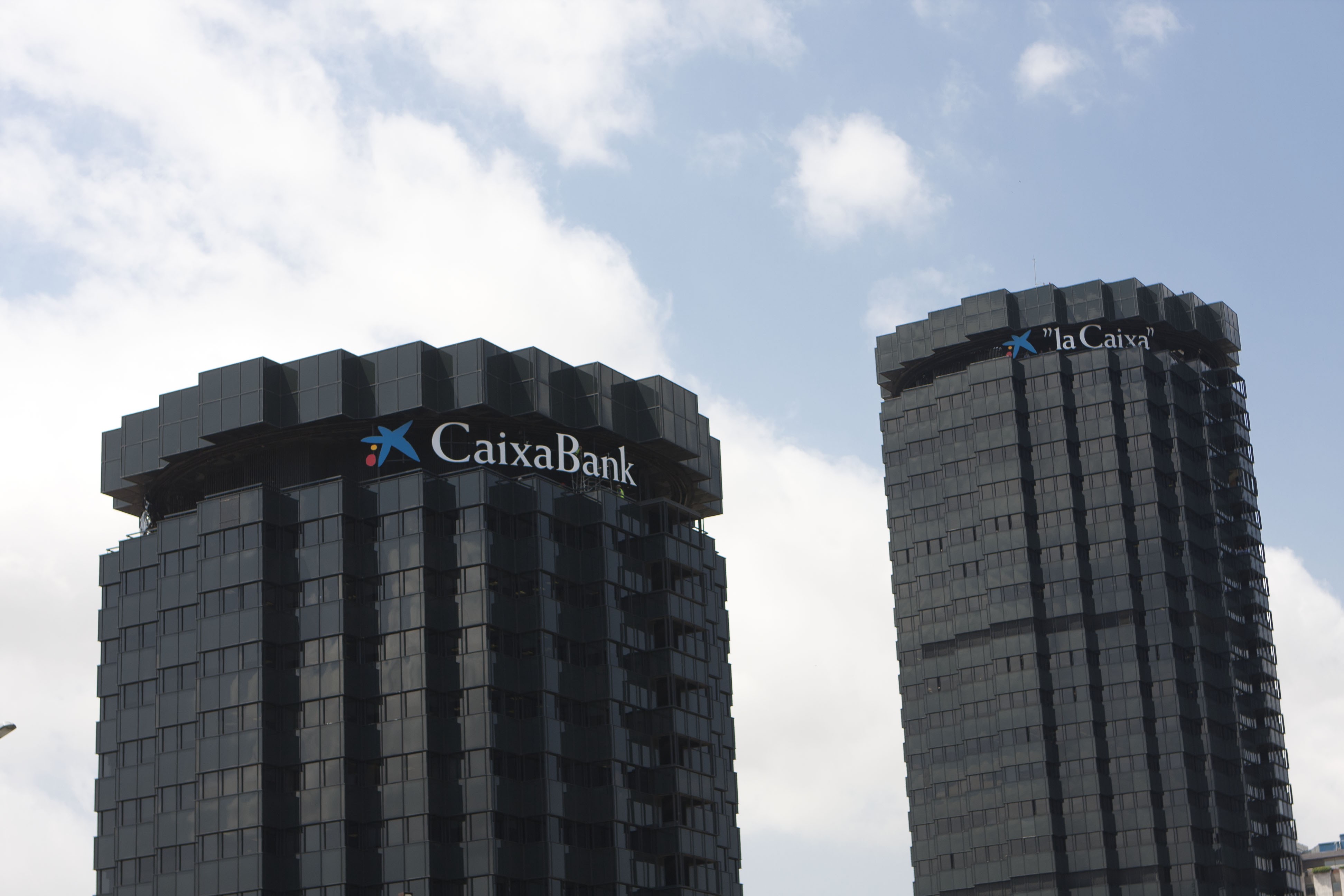
- As of today, the "la Caixa" Group's two office towers in Barcelona will feature the logos of CaixaBank and "la Caixa".
- The institution will keep using the "la Caixa" trademark for its branch network, ATMs and customer services.
Caja de Ahorros y Pensiones de Barcelona, "la Caixa", today installed its new corporate logo at the Barcelona headquarters, with the "la Caixa" brand featuring on the tallest tower and the CaixaBank logo replacing the Criteria CaixaCorp logo on the smaller tower. The "la Caixa" headquarters in Madrid will also carry the new logo.
This change is a symbolic culmination of "la Caixa" Group's restructuring, which began in late January, with the transfer of the institution's financial operations to CaixaBank, the company that is due to be registered with the commercial registry today and tomorrow, 1 July, will be listed on the Madrid and Barcelona stock exchanges.
The "la Caixa" logo will retain its prominent visibility and strong brand recognition. All retail banking operations in Spain will be run under this trade name, meaning the "la Caixa" brand will still be used at all branches and the ATM network, in online banking services, mobile banking and all other financial services (bankbooks, cheques, cards, etc.)
All advertising, analysis reports from the "la Caixa" Research Service and internal documentation for employee use will also continue to use the "la Caixa" brand.
CaixaBank, the brand of the listed bank
Meanwhile, the CaixaBank brand will be used only for the Group's stock market listed company. This logo and term will therefore be used for all stock market activities and contractual documentation. The CaixaBank logo is now featured on the lower of the two towers at the Barcelona headquarters, where the Criteria CaixaCorp logo was previously displayed.
The building, the work of architects Jose A. Coderch and Jordi Martí, was acquired by "la Caixa" in 1979, while the institution began moving its central services into the towers as of 1982.
The strategic value of the "la Caixa" brand
Due to its strategic value, "la Caixa" will remain a trademark following the Group's restructuring, the aim of which is to safeguard the entity's commitment to its founding values and welfare projects. Furthermore, by maintaining the "la Caixa" brand the institution will ensure stronger ties with its customers.
The service excellence and commercial success generated under the "la Caixa" brand has made it a valuable asset to the Group. According to the Merco Marcas brand report, it is the highest rated financial brand in Spain, recording outstanding results in terms of user recognition, ethics and social responsibility. In 2010 the entity was awarded the Centro de Marca Prize, given by Esade and Accenture, in recognition of its excellent brand management and use of the brand as a strategic asset.
History of a symbol
At the end of the 70s "la Caixa" decided to create an original corporate identity that would set it apart from other Spanish financial institutions. The idea was to endow "la Caixa" with a unique personality, both easily identifiable and easy to identify with. Of all the proposals on the table, the most appropriate and innovative was selected: to commission the universally recognized artist Joan Miró to create a tapestry from which an emblem could be taken.
Thus, in 1980 the star and its colours - so Mediterranean and typical of Miró's work - became the institution's symbol. Since then, the "la Caixa" symbol has been at the vanguard of corporate branding in the Spanish financial sector.
